Components for every framework.
175 components, from a button to a color picker, a signature pad or a guided tour. Each on React, Vue, Svelte and Solid, with live demos and the code. Free with an account.
Every component
175 components.
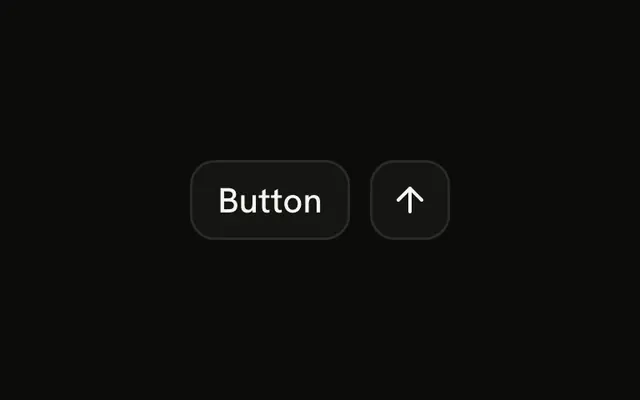
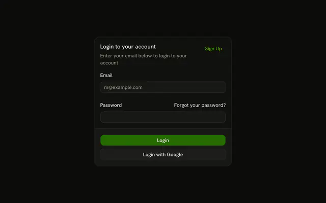

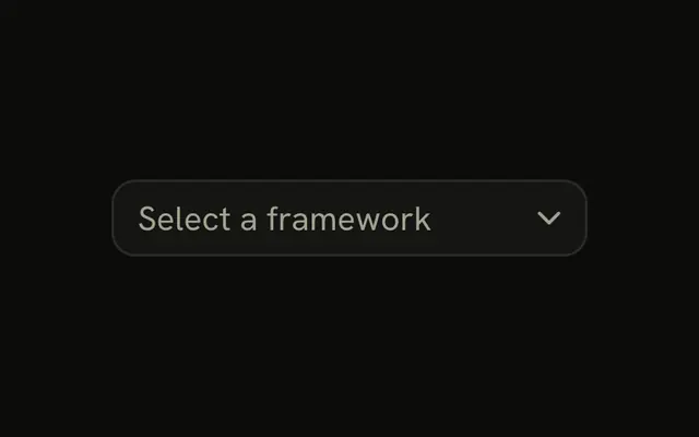
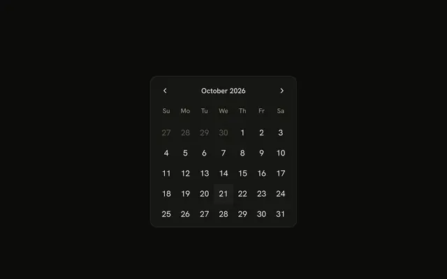
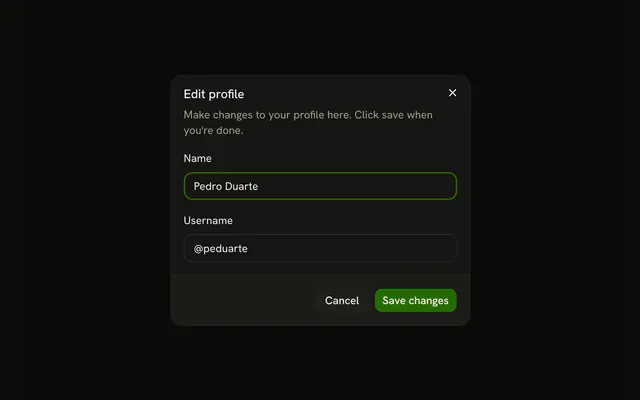
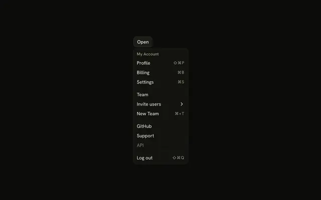
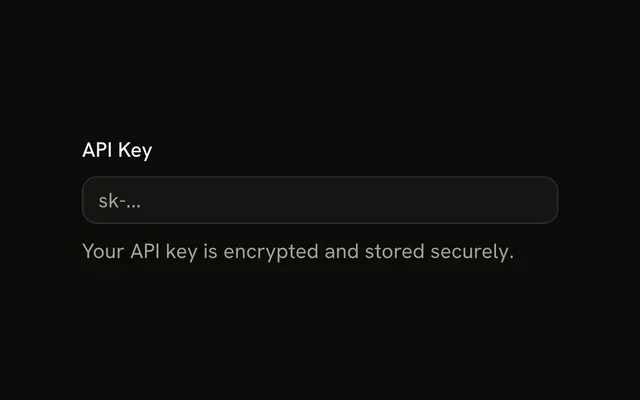
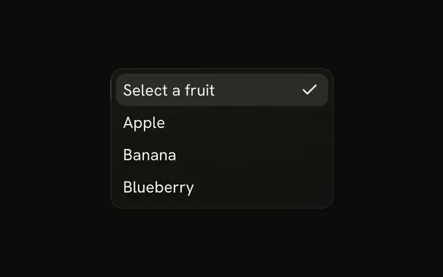
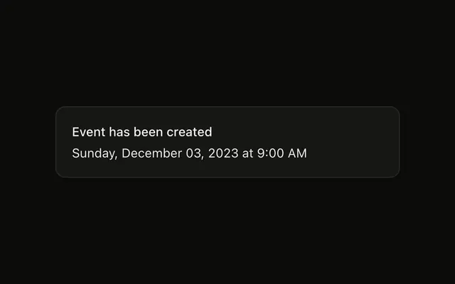
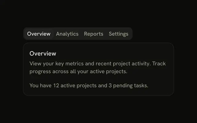
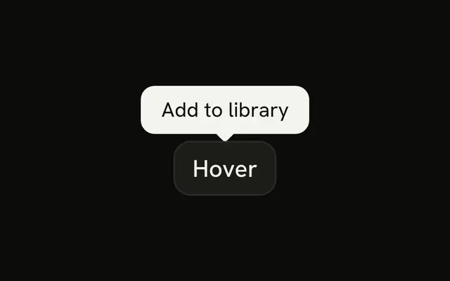




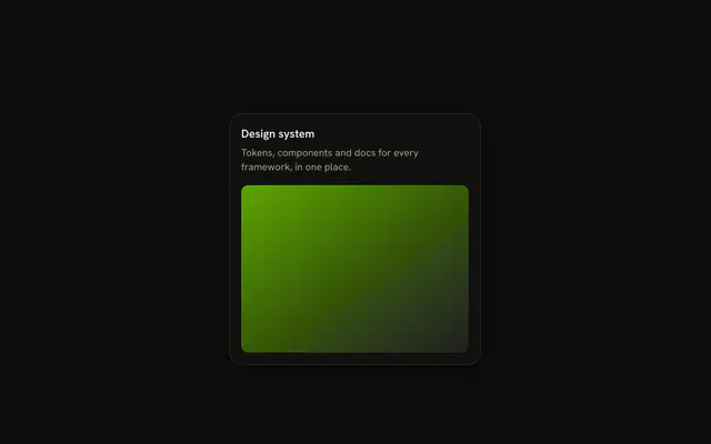
Or skip the search. With Pro, your AI agent picks the component you describe and installs it on your stack.
Get ProPricing
Every component, one prompt away, with Pro
Your AI agent installs any of the 175 components, and every example, block and icon, with every Pro plan.
4.9/5 out of 5 · 150+ reviewsfrom 150+ founders and developers.
- Secure checkout via Stripe
- Code lives in your repo
- Keep what you've shipped if you cancel
- License terms
FAQ
Frequently asked questions
What developers ask before adding shadcn components to a project.
175 components in 17 groups, the largest being AI (44), Inputs (15), Media (14) and Navigation (13). Each has a page with live demos, its anatomy, its API and the code.
Most projects start with Button, Input, Select, Combobox, Dialog, Dropdown Menu, Tabs, Card, Tooltip, Date Picker, Sonner and Color Picker. The catalog lists them first, before the rest by name.
No. shadcn/ui is the open-source library by @shadcn, at ui.shadcn.com. shadcn.io is an independent project built on the same ideas: the same CLI and the same theme tokens, so its components work in a shadcn/ui project.
No. Installing copies the component's file into your project, with the packages it needs, and the code is yours to edit. There is no shadcn.io package to keep updated.
React on four headless libraries (Base UI, Radix UI, React Aria and Ark UI), and Vue, Svelte and Solid on Ark UI. React has 175 components, Vue 169, Svelte 169 and Solid 169. The catalog opens on React with Base UI, the default.
Use the one your project already has: every component is on all four libraries, with the same names. Base UI (@base-ui/react) is the default, and the catalog at /ui shows it.
Use the framework and library pickers at the top of any component's page. The catalogs are at /ui (Base UI), /ui/radix, /ui/aria, /ui/ark, /ui/vue, /ui/svelte and /ui/solid, and the demos, the code and the install command follow your pick.
Vue, Svelte and Solid have 169 of the 175 components, all on Ark UI, each generated from the React one and following its framework's idioms: Vue's callbacks are events, Svelte's render props are snippets, Solid's are functions.
Signed in, copy the command on the component's page, such as `npx shadcn@latest add @shadcnio/button`. It adds the file to your components folder, with the packages it needs. The `@shadcnio` entry in components.json reads your token from SHADCNIO_TOKEN in .env.local, so the token is never in the command.
Yes: the installation docs have a guide for Next.js, Vite, React Router, TanStack Start, Astro and Laravel, and a manual one. Each sets up Tailwind CSS, the import alias and components.json.
Yes. Each component's page has a Manual tab with every file and package, and the installation docs have a manual guide for the alias and Tailwind setup.
Yes. The components use the same shadcn CLI and the same theme tokens as shadcn/ui, so they drop into a project that has it. Files land in your components folder next to the ones you already have, and use your project's tokens.
With CSS variables, the same token set as shadcn/ui: background, foreground, primary, secondary, muted, accent, destructive, border and the rest. Override them in your CSS and every Base UI component follows; the styling guide lists each token and what uses it.
Yes. Dark mode overrides the same tokens inside a .dark selector, so the same components work in both. The colors guide documents the palette.
Lucide, through lucide-react, as in the demos. The code is yours, so swap an import to use another icon set.
Each is built on Base UI, a headless library that follows the WAI-ARIA patterns for focus, keyboard and screen readers. 85 components list every key they answer on their page.
Yes. Layouts use logical properties (ms-, pe-, start-), and 57 components have a right-to-left demo. The RTL guide shows how to set the locale and the dir attribute.
Yes: browsing and trying every demo needs no account, so you can tab through a Base UI component's demo before installing it.
React Hook Form, TanStack Form and Formisch, each with a guide that builds a validated form from the Field component: a label, a description and an error around each control, with a Zod or Valibot schema and the submit.
Put the control in a Field with a FieldLabel, a FieldDescription and a FieldError. Pass `invalid` on the Field as your form library reports it: the field turns destructive and its controls get `aria-invalid`, with nothing to add on them.
27 components are inputs and choices, such as Field, Input, Select and Date Picker, from text fields to color pickers and signature pads.
With Pro, the MCP server (22 tools): describe what you need and your AI agent searches the catalog, picks the component and installs it. Setup guides cover 38 clients, and your files never leave your machine.
It calls search_components, which finds a component by what it does, such as a modal or a date range, aliases included, and then get_install_command for the command. Tell it your framework and library and it installs for that stack.
44 components are for AI interfaces, such as Message, Prompt Input, Chat and Reasoning: chat turns, agent steps and the prompt they answer. They are free like the rest.
Yes. Every component is free with an account, which is one tap with Google or GitHub. Pro adds the blocks, the premium templates and the MCP server, and none of the 175 components needs it.
No. Browsing and trying every demo needs nothing. Seeing, copying or installing the code takes a free account.
Yes. The terms say the components are open source: use them in personal and commercial projects, modify them and share your changes. Pro blocks and templates have their own license, and commercial use of those takes a Team or Organization plan.
The MCP server, every block and the premium templates, plus the Pro items of the animated button, text, background and shader collections. The components stay free.
4.9 out of 5 from 150+ developers


Every component. One prompt away.
175 components, free with an account. With Pro, your AI agent installs them from a prompt.
Get Pro