solaris.shadcn.io
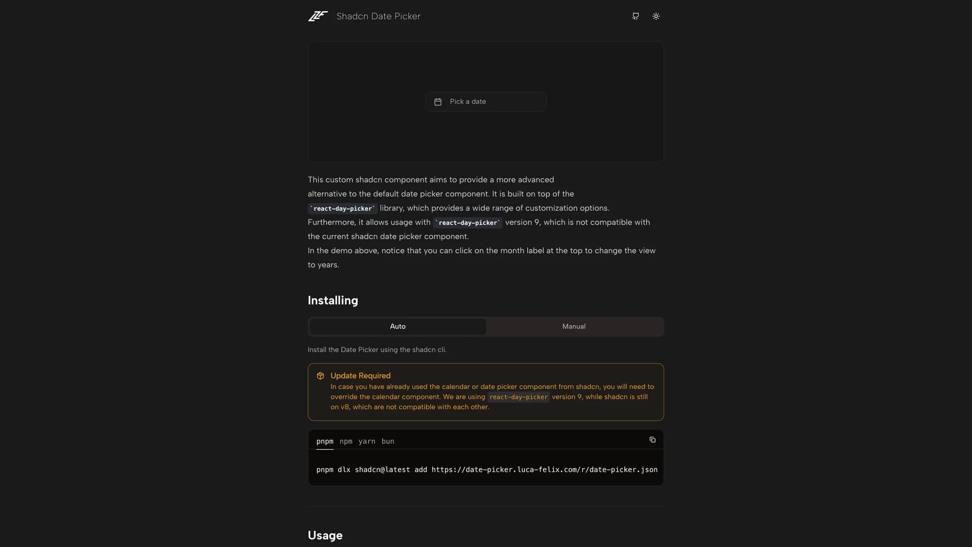
Shadcn Date Picker is an advanced date picker component built with React, TypeScript, and Tailwind CSS, offering a more sophisticated alternative to the default shadcn/ui date picker with enhanced navigation and selection capabilities.
by Flixlix · Updated October 8, 2025
Interact with the actual deployed template — every section, every interaction, no mockups.
Built on the react-day-picker library, this custom component provides range date selection, year and month view navigation through intuitive month label clicking, and a highly customizable interface that improves the user experience of date selection in forms and applications. The component addresses common frustrations with basic date pickers by enabling users to quickly navigate across years and months without tedious clicking through individual months, making it particularly valuable for applications handling date ranges, historical data entry, or any scenario requiring efficient date selection across large time spans.
Perfect for booking systems, analytics dashboards requiring date range filters, event management platforms, calendar applications, or any interface where date selection is a frequent user action and improved UX translates directly to productivity gains. Fully compatible with the shadcn/ui design system and responsive across devices, this date picker demonstrates how thoughtful enhancements to fundamental UI components can significantly improve user workflows and application usability.
Hand-built premium templates from shadcn.io — production-ready and bundled in Pro.