solaris.shadcn.io

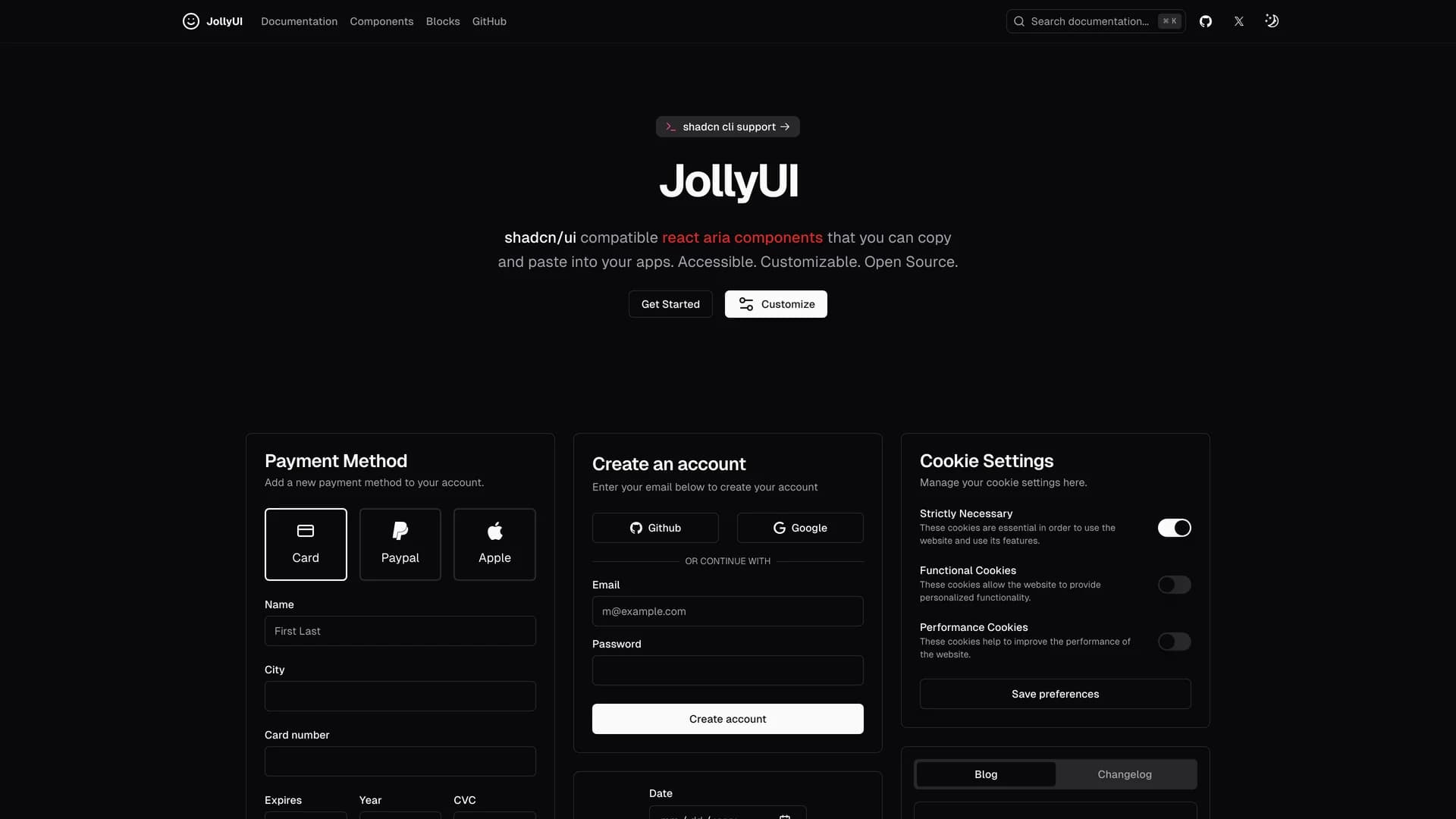
Jolly UI is an open-source React component library that provides accessible, customizable components built with React Aria and compatible with shadcn/ui, allowing developers to copy and paste production-ready accessible components into their applications.
by Jolbol1 · Updated October 8, 2025
Interact with the actual deployed template — every section, every interaction, no mockups.
Written primarily in TypeScript (86.9%), the library combines React Aria's robust accessibility primitives with Tailwind CSS styling and shadcn/ui's design language to deliver components that are both beautiful and fully accessible. Maintained by James Shopland with community contributions, Jolly UI offers comprehensive documentation at jollyui.
dev covering component APIs, usage examples, and integration guides. The library focuses on providing high-quality, accessible alternatives to standard UI components, ensuring keyboard navigation, screen reader support, and ARIA compliance work correctly out of the box. Built with Next.
js and leveraging React Aria's proven accessibility foundations, Jolly UI components handle complex interactions like focus management, keyboard shortcuts, and touch interactions while maintaining visual consistency with shadcn/ui projects. Perfect for developers who need shadcn/ui-compatible components with React Aria's superior accessibility features, Jolly UI demonstrates how to build inclusive user interfaces that meet WCAG standards without sacrificing design quality or developer experience.
Hand-built premium templates from shadcn.io — production-ready and bundled in Pro.