solaris.shadcn.io
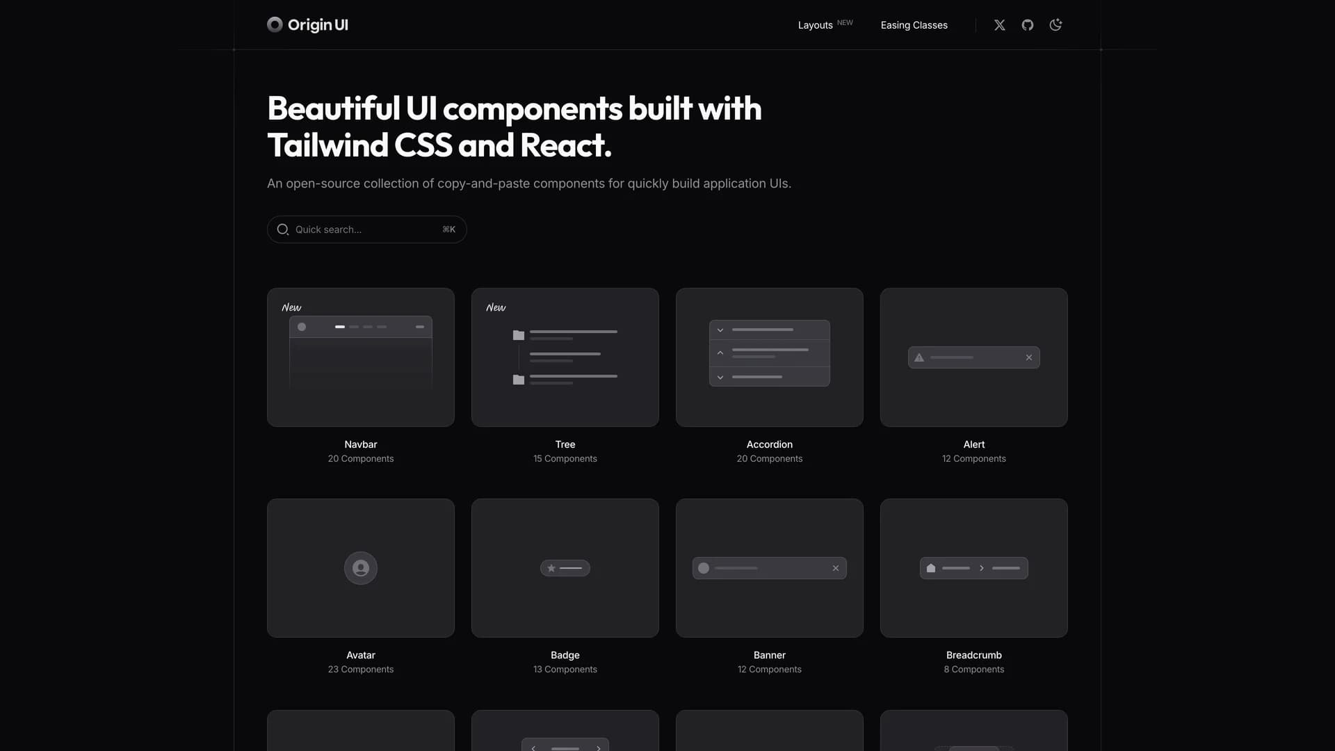
Origin UI is an open-source React component library offering an extensive collection of hundreds of copy-and-paste components designed for rapidly building modern application interfaces.
by Origin space · Updated October 8, 2025
Interact with the actual deployed template — every section, every interaction, no mockups.
Powered by Tailwind CSS v4 and built for seamless integration with Next.js and React projects, Origin UI follows the same shadcn conventions and copy-paste philosophy that developers love, giving you full ownership and control over your components. The library provides beautifully designed, production-ready UI elements spanning forms, navigation, data display, feedback components, and complex interactive widgets, all styled with Tailwind's utility-first approach for easy customization.
Each component is built with accessibility in mind, leveraging Radix UI primitives and React Aria for keyboard navigation and screen reader support. Perfect for developers who want a comprehensive component library without the overhead of npm dependencies, Origin UI enables you to quickly scaffold application UIs by simply copying the components you need directly into your codebase, customizing them to match your brand, and shipping faster without sacrificing quality or flexibility.
Hand-built premium templates from shadcn.io — production-ready and bundled in Pro.